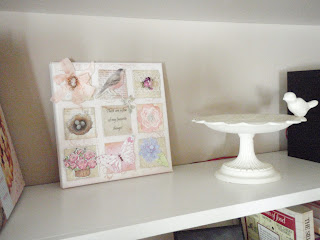
I have tweaked and tweaked my mantel for Spring and I'm still not happy with it...it looks unbalanced to me.
I like my wire and glass bird cages and I always use my whitewashed window...I added the white ceramic tray to set off the nest (I hate the color of the brick wall) and added 2 other white birds but it's just not doing it for me this year.
The little patterned soft bird in the cage was made by my friend Mary Lou at House of Whimsey.
Here are a few more bird-related items on my shelves.
Any advice?
Now the "G" wall, on the other hand, has shaped up very nicely I think.
I love monograms and I started to collect G's a few years ago. I love the way they look against the Latte colored wall.
I think my favorite G is the black lower case funky one. Can you read the plaque? It says "There is nothing like staying at home for real comfort." We love our home and before we retired, home was the place we most wanted to be at the end of the day.
Isn't it strange how different the wall color looks in these 2 photos? The true color is closer to the first picture.
I saw this original watercolor on a charity auction on eBay last Fall and fell in love with it. I love the treatment of the light and shadows cast by the moon. I know it's a Winter scene but it's staying right where it is year round. It's hard to photograph because of the glass but if you click on it to make it bigger, you can see it better.
This plain Jane G has been hanging on a different part of the wall for about 2 years. I've never done anything to it and I need to. I'm thinking about book page decoupage..it needs some personality.
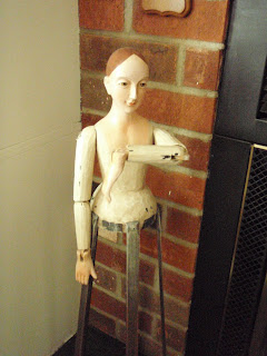
My friend is checking her watch and saying it's time to stop for now.
I hope you're having a good week!
xoxo
joyce


4 comments:
good morning Joyce! love it all! OK, my suggestion for balancing out your mantel, the window frame in the center. to the right side but half in front of the window the tray and nest, a little behind the tray and over to the right bigger piece with the nest in it. on the other side of with window try the wire cage with the bird on the plate facing sort and off to the side of the window. then the other three little pieces in front of and on the left side of the window. did any of that make sense? I think it might balance it out a little. Have fun!!!
xoxo
Hmm, the mantle does look unbalanced... I have no suggestions, sorry. I like all the pieces though. Hope you can figure out a way to put them that makes you happy.
Your G wall looks marvelous! Never thought about doing that. Neat idea. So many interesting things to look at in your house. I love seeing how others decorate. Can't wait to see more.
There's symmetrical balance,and asymmetrical balance. Try taking one of the birdcages and putting it in front of the window, just slightly to the left and put the bird on a pedestal off to the left with the other cage. Another version....try standing the window in it's taller position in the center of the mantel and arrange the other goodies off to either side. Find a banner or make one that you can hang on the window. If you can find a decent sized bare tree branch with some interest to it either in natural or white, you could incorporate that into the mix, too.
Just some ideas!
Hugs,
Meri
What about sing the window in the center, with one of the "cages" on either side. Add some random books to use as risers underneath them. That way you can give them a little height. Then you can display the platter, pedestal, birds & nests across the front edge. Do you have anything else you can hang in the window?
My thoughts...for what they're worth!\
I agree with Jo - LOVE the "G" wall!
Post a Comment